Most investors understand that the stock market doesn’t follow the economy, it leads it. That means we cannot wait for a recession to get out of the markets because the markets generally start to fall months before a recession kicks in.
If the stock market tops before the economy goes into a recession, how do we know when the stock market is going to top? Fortunately, there are a couple of key LEADING indicators that always precede a recession, and more importantly for investors, a major top in the stock market. These key indicators are the Yield Curve and the Conference Board LEI Index.
Yield Curve:
Normally, long-term yields are higher than short-term yields for the logical reason that lenders want a higher risk return when lending money for 10 years than they would for lending it for 2 years. There is a higher risk that the longer term loan may not get paid back in 10 years.. But occasionally, this relationship changes, and short-term yields rise above long-term yields. Because investors are willing to accept a lower yield in the longer-term 10-year bond over the 2-year warns that these investors are expecting lower rates in the future so the demand for longer-term bonds increases, pushing yields lower (bonds prices and yields move opposite each other).
When short-term yields are higher than long-term yields, the yield curve (spread between the long-term and short-term yields) is said to be “inverted” and when it happens it has historically been one of the most accurate predictors of recessions and the start of major bear markets in stocks.
The red circles on the following chart show each time since 1990 when the yield curve ‘inverted” (below zero). Once inverted between 12 and 18 months later we see a recession starting (grey bars). We can see on the far right that the current spread is not inverted, but it is getting very close. The current spread between the 10-year and 2-year yield is only .17%.

Conference Board LEI
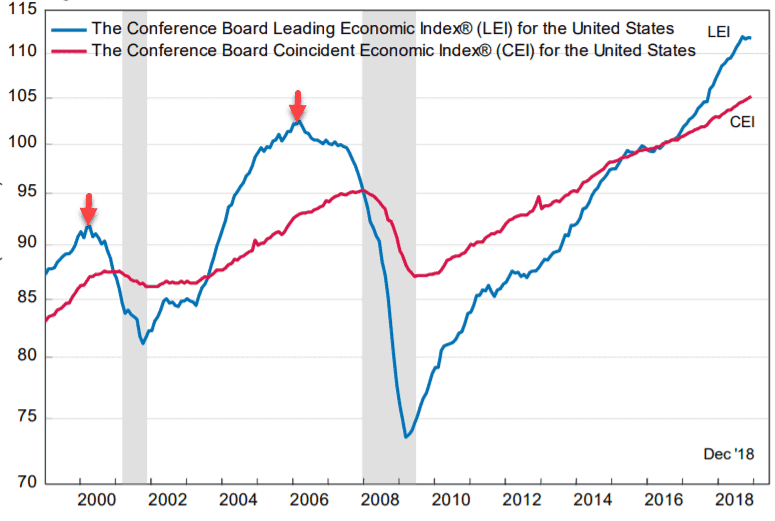
Another leading indicator we pay attention to is the Conference Board Leading Economic Indicator (LEI). The LEI for the US looks at 10 different economic indicators, everything from employment, to housing, to interest rates. Like the inverted yield curve, this indicator has an incredible track record of predicting recessions. On the chart below we can see how the red arrows highlight that when the LEI (blue line) tops out it always precedes a recession. Looking at the top far right corner we can see that the LEI has leveled off, but has not yet topped out, but we need to keep our eye on that.

A road-map to a stock market top
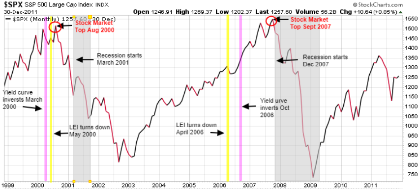
Now let’s look at how these indicators warn of coming stock market tops. On the chart below the pink vertical lines show when the yield curve first inverted, the yellow vertical lines show when the LEI topped out and started turning down, the red circles show when the stock market had a major top, while the grey shaded area shows a recession. We only show the last two stock market crashes in this chart, but the story is the same for decades. Every major stock market top was preceded by an inverted yield curve and a top and decline of the LEI.

In the 2000 DOT COM market crash the Yield Curve inverted 12 months before the recession and 5 months before the stock market top. The LEI topped out 10-months before the recession and 3 months before the stock market top.
In the 2007 Financial Crisis stock market crash the LEI topped out 20 months before the recession and 17 months before the stock market top. The Yield Curve inverted 14 months prior to the recession and 11 months before the stock market top.
So while the talking heads are calling for the end of this bull market in stocks, we will wait for proof. That does not mean we will not see a very volatile market with many spikes both up and down.
Once we see the negative signals from these two key LEADING indicators we should have at least a few months warning before we see the top in the stock markets. We regularly update Trend Letter subscribers on the status of these indicators.
At this time our models are indicating we will see a final run up in stocks, likely to new highs, before we see the top in the stock markets.
But make no mistake, while we see higher highs before the bubble finally pops, the risk of a serious market pullback has risen significantly in recent months. We always preach to subscribers to always decide on an exit strategy BEFORE you make any investment. Always have a plan to get out in case the market moves against you. For our subscribers we always identify our BUY and SELL Stops before we enter a trade. If the trade starts to rise, then we raise our SELL Stop. If our SELL Stop is hit, we SELL. Each investor is responsible for deciding the right BUY and SELL Stop for their situation. Work with an independent financial analyst to ensure that you are not taking on too much risk.
One thing we know is that while the next bear market is not necessarily imminent, it is inevitable. If you’re nearing retirement or already retired, it is time to have a plan to get “defensive”.
With this historic market melt-up now over 9-years old, it is time for all who have equities exposure to prepare for the inevitable market melt-down.
Are you prepared?
Seriously think about subscribing to our hedging service Trend Technical Trader and put yourself in position to not just survive the coming melt-down, but to actually profit from it.

Stay tuned!


