
Market update – October 28/20
According to data compiled by LPL Financial, historically the S&P 500 averages its highest return of the entire year on October 28th. Well, that certainly was not the case today, the markets got hammered.
There were many factors contributing to today’s slaughter, and leading the way were fears related to soaring coronavirus case numbers, especially in Europe, followed by Trump’s apparent acknowledgement that a stimulus package won’t be passed prior to the election. And then of course there is the election itself.
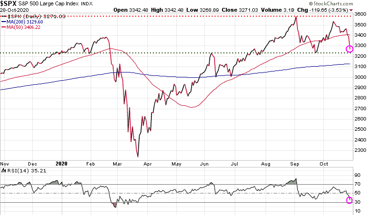
The S&P 500 – dropped 119 points or 3.53%.
The S&P 500 has fallen through its 50-DMA (red wavy line) and is approaching near-term support at 3220. The 200-DMA (blue wavy line) will be a key test of support. Note at the bottom of the chart, the Relative Strength Index (RSI) is at 35.21, not yet in oversold territory.
Gold – down 32.70 or 1.71%
Gold also took it on the chin as fears of the global economy falling into a deeper recession or even a depression suggest deflation, not inflation. Deflation is not gold’s friend. Gold remains in it near-term downtrend channel and will need to break out of it before we can start thinking of a breakout.

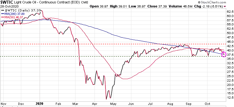
Oil – down 2.18 or 5.51%
Oil also got smacked and is close to testing near-term support at 36.80
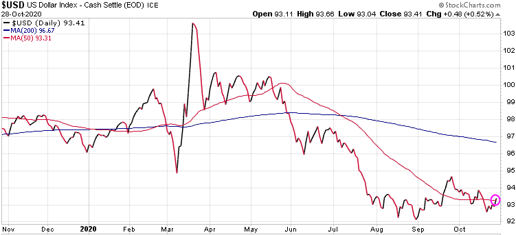
US Dollar – up .48 or .52%
When investors get spooked they look to safety, and the $US is the safe haven currency.
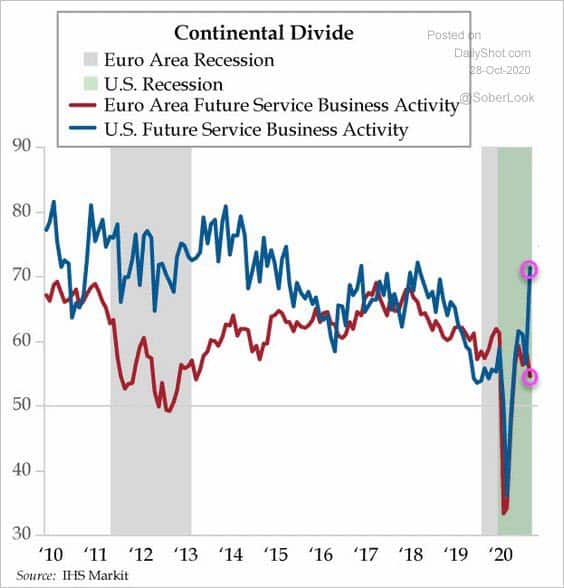
Interesting chart comparing US service sector to the Euro Area. Those who think the Euro will outperform the $US need to have a good look at this chart. The gap between these two economies is now at the widest it has been since the Euro crisis in 2012.
Stay tuned!